Imagine how boring the world would be in black and white! Luckily, most people see life in a full spectrum of color. Color is a form of nonverbal communication – a visual language, if you will – that can inspire a visceral emotional response. For this reason, color is a great way to quickly and dramatically communicate both your personality and style. So, if you’re considering remodeling your home, color should be a major factor in your design process. Here are some helpful tips for choosing the right colors in your new interior space.
1. Determine “The 3 Ws”
Like any good story, color selection begins with pinpointing the “who,” “what,” and “where,” otherwise known as “the 3 Ws.” Identifying the 3 Ws as they pertain to your new remodel will help you narrow down your color options.
What? – What is the function of the space? Consider the kind of ambiance you want to create. Are you going for a tranquil, spa-like atmosphere in your primary bath? Try soft, neutral colors for a calming effect. Is your new media room designed for gameday entertaining? A warm color – like red – could be energizing.
Who? – Who will be using the space? Are you remodeling a child’s playroom or the bedroom of an elderly adult? Children often enjoy vibrant color palettes. Visually contrasting colors can also play a helpful role in safety for the elderly.
Where? – Where is your space located? Climate can have a big impact on the color scheme you choose. Hot, dry climates can inspire warm colors, while cool, wet climates may inspire muted colors. You can choose to go with your surroundings, or defy them for an unexpected theme. Let bright interiors combat dreary skies, or try soft, cool colors to help offset the heat.
2. Spin the Color Wheel
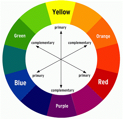
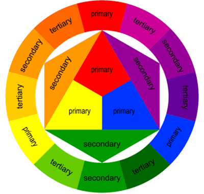
If you’re still totally stuck, the color wheel is a useful tool for selecting colors. The color wheel shows the relationship between primary, secondary, and complimentary colors. As the basis of all colors primary colors (red, yellow, and blue) form a triangle within the color wheel. From there, you can see the relationship between the three primary colors and the secondary, complimentary, and analogous colors. Complimentary colors are opposite from each other on the color wheel. When paired together, complimentary colors create a vibrant effect. Analogous colors are located next to each other on the color wheel. Pairing analogous colors together in a space gives a sense of visual harmony.
3. Develop a Colorful Vocabulary
It can also be helpful to familiarize yourself with terms like shade, tone, and tint as it relates to color selection. In color theory, a tint is the mixture of a color with white, increasing its lightness. Alternatively, a shade is the mixture of a color with black, which darkens it. A tone is produced by the mixture of a color with gray, or by both tinting and shading.
For example, say you want to paint your living room blue. The difference between a darker shade of blue like this…and a lighter tint of blue like this…is dramatic:
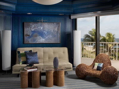
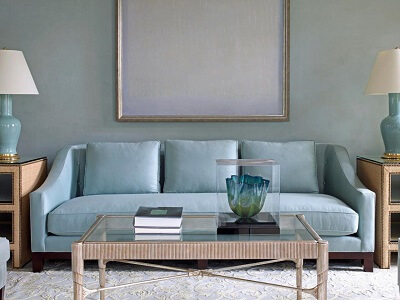
The two shades create entirely different aesthetics, invoking completely different feelings. So, it’s worth taking a little extra time to consider the shade of the color you choose.
4. Light Up Your Life
Color is directly affected by light, whether it’s natural sunlight, ambient, task, or accent lighting. As the lighting in a room changes, so does our perception of color. So, evaluating colors as the light changes is integral to choosing colors for your remodel that you will enjoy – at any time of day.
The best way to predict color changes due to lighting is by putting your paint samples to work. Simply tape a few paint color chips to the wall and revisit them over the course of the day. How do they look in the early morning light? Which color do you prefer in the direct midday sun? Do you like the look of your chosen colors in artificial light?
5. Cool It Down or Warm It Up
The psychological effects of colors are undeniable. Countless studies have assessed the mental, physical, and emotional responses we have to color. One such study found that individuals exposed to the color red experienced increased heartrate and adrenaline response. Colors can also provoke emotional responses. For example, warm colors like red, orange, and yellow can convey high energy, intensity, warmth, and comfort. On the other hand, cool colors like green, blue, and purple, can help create a feeling of calm and serenity.
Red – Red is the color of romance, passion, ambition, energy, and determination. Red is a versatile warm color useful in both contemporary and traditional design styles. That said, red is not for the timid. Consider a red accent wall to add definition in a larger space, or paint a small powder room a shade of red to make a big style statement. Want to reinvigorate your workout? Try red in the gym!
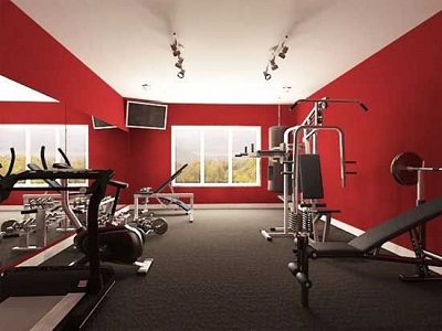
Yellow – Yellow is a happy, optimistic color said to spread cheer and promote creativity throughout the home. Light shades of this warm color can be used to make small spaces seem larger. For an energy boost to your morning routine, consider adding a splash of yellow to your bathroom or kitchen. The sunny color is bound to help jumpstart your day.
Orange – Orange is coming back into vogue. As the color child of both red and yellow, this warm color balances the intensity of red with the happiness of yellow. Orange is said to stimulate appetite, too, making it a chic choice for kitchen and dining areas.
Blue – The consummate cool color, blue represents strength and dependability. Blue tones are perfect for the bedroom where a fresh, peaceful ambiance is necessary for relaxation and a good night’s sleep. Blue is even said to help lower blood pressure! Light shades of blue make a space feel open, while darker shades add drama. This cool color is especially recommended for high-traffic areas like kitchens and living rooms to inspire calm and tranquility where it’s needed most.
Green – Bring the best of the outdoors inside with a soothing shade of green. Green is so versatile that it compliments most interior spaces. Studies show that the eye focuses green directly on the retina, allowing the eye muscles to relax. Is your home remodel in need of a physically relaxing vibe? Go with this cool color!
Purple – Purple is a cool secondary color that combines both blue and red for a balance of stimulation and calm. Light purple is perfect for any room in need of a little peace, so give it a try in your home or business office.
When all is said and done, the most important advice we can give you is simple: Pick the color that makes you feel the best. Whatever color palette you choose for your home remodel, make sure it’s one you enjoy. In the meantime, check out our design gallery for more inspiration. We’re full of colorful ideas for every room in the house.


